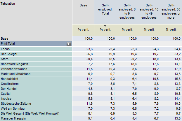
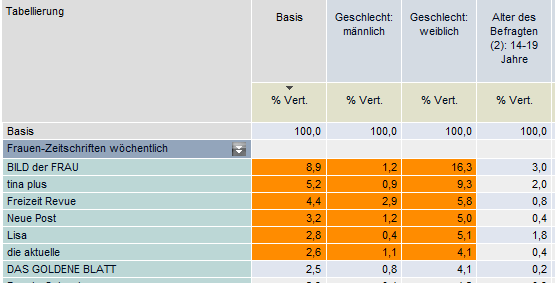
Charts: producing graphical reports
Select the table cells that are to be displayed as a graphic. The graphics window is accessed using the Chart button on the toolbar.
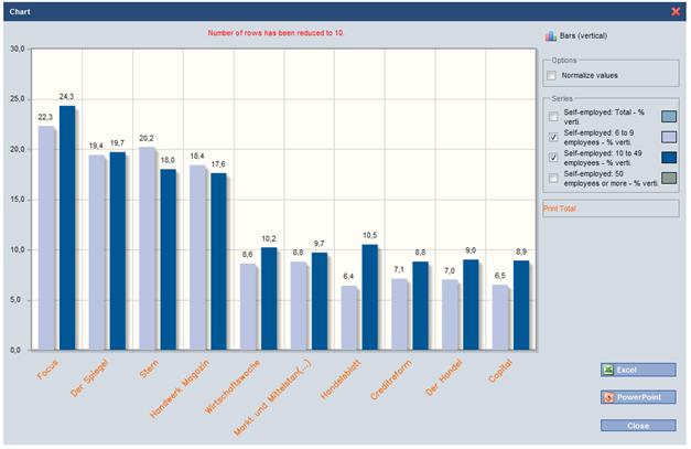
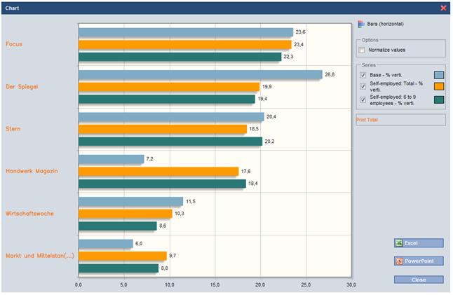
The Chart screen limits the number of entries on the X-axis to a maximum of 10. If more than 10 entries are present, navigation icons are shown on the lower edge of the screen for paging backwards and forwards.
If no table section has been marked before accessing the Chart screen, then the first 10 rows and the first 5 columns are made available for creating charts in this window. A corresponding message is also output: "Number of rows reduced to 10. Number of columns reduced to 5."
If the base column is not explicitly marked in the table for graphical display, then it will accordingly not be provided for the creation of charts.
The initial graphic is created using the pre-column marked: all other selected columns are then made available in the "Series" field for inclusion in the graphic. Click the colour field to access the colour selection for the attribute.
The results can be represented using a line, column, bar or pie chart.
The graphic is output via the "Excel" button as an editable chart: the chart itself is embedded on the "Chart" worksheet and the report is included on the "Data" worksheet.
Example: Creating a chart without marking
The first 10 rows and the first 5 columns are made available for creating charts in the window.
The default behaviour is to skip the base column.
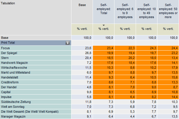
Example: Creating a chart from a range of marked columns
Here, the base column can be displayed on the chart.
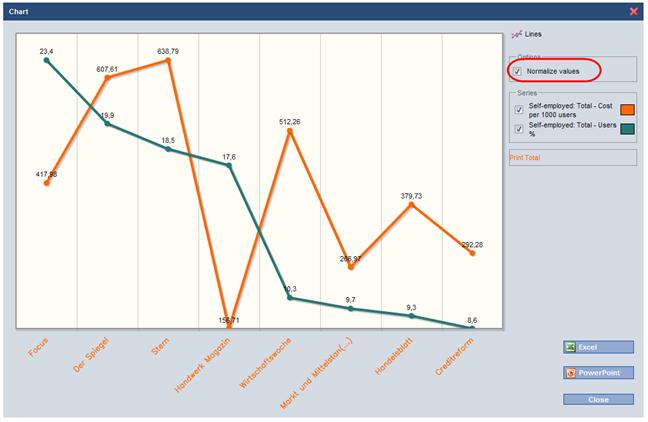
Normalising value range
If characteristics containing different value ranges are to be presented on a single chart, then this option can be used to normalise the scaling of the characteristics across the x- and y-axes.
Without normalisation, the graph for "Exposures in m." will be shown to the scale of "EUR per 1000 Exposures".
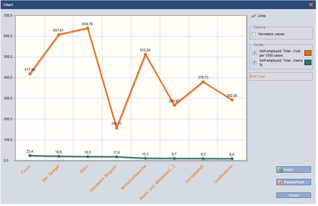
If the "Normalise values" option is checked, then each column is scaled individually on the chart.